Projects
Here are a few projects for which I was the lead user experience designer. For additional examples, contact me.
Brightcove Campaign: Helping Marketers Get More Out of Video
The Business Ask
The online video platform Brightcove was interested in growing their demand generation marketer segment, since this group was already starting to use video as part of their campaign efforts. But investing in video is often expensive in both time and resources. Additionally, what constituted a "good" video was limited to generic best practices (e.g., shorter videos are better). Our team's primary task was to create an offering that would leverage Brightcove's expertise in a more impactful way.
Other Challenges
Marketers were overwhelmed with the day-to-day tasks of managing marketing campaigns, which use a wide variety of content types that live on different platforms. During preliminary customer visits, our team observed marketers using a variety of workarounds and tools (including Brightcove’s app) to create campaigns. In addition, their workflows often relied on more technical team members to create content and track metrics.

The Human-Centered Solution
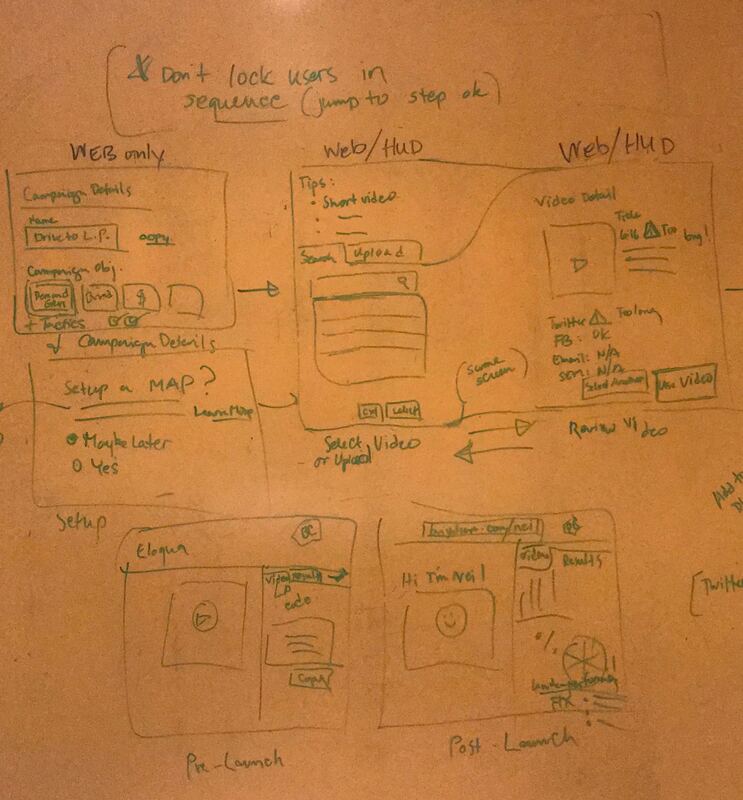
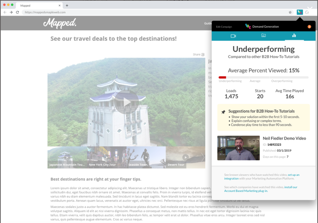
Armed with our on-site learnings, I facilitated a week-long design sprint, during which our cross-functional team converged on an idea that performance quality could be measured if we were able to create meaningful comparisons between similar types of videos (e.g., testimonials) across our customer base. The catch? We did not have this data. Additionally, to drive significant value for demand gen marketers, we had to give them this insight with minimal effort on their part.
The design sprint yielded two ideas that I prototyped and tested: use of a Chrome extension that would allow marketers to track video performance via a “heads-up display” accessible wherever the video was embedded; and an advice service that would provide tips for improving play rates for each type of video. To make this happen, our team followed two workstreams: one for the user experience of uploading and monitoring video performance, and the second which created a framework for categorizing customer videos across eight types and analyzing their performance (what eventually became a Video Benchmark Score, or VBS).
The end result was Brightcove Campaign, which currently consists of an analytics dashboard within the app, and the Chrome extension for performance tracking outside of the app. For the first time, demand gen marketers are now able to compare their videos' performance against similar content of the same type, with minimal disruption to their larger campaign workflow.
Centers for Disease Control and Prevention's "Every Day, Every Dose" App for Medication Adherence
The Business Ask
The Centers for Disease Control and Prevention (CDC) and public health consulting organization John Snow, Inc. (JSI) wanted to create a native mobile phone app for both iOS and Android devices to support HIV medication adherence. Our primary task was to make it as easy as possible for patients to log doses of what is often an unpleasant regimen of medications.
Other Challenges
Front-end research and interviews revealed that HIV medication adherence is a complicated undertaking, impacted by privacy concerns and social stigma. Patients needed more than just the periodic reminder—they also needed motivation and encouragement to stay on track.
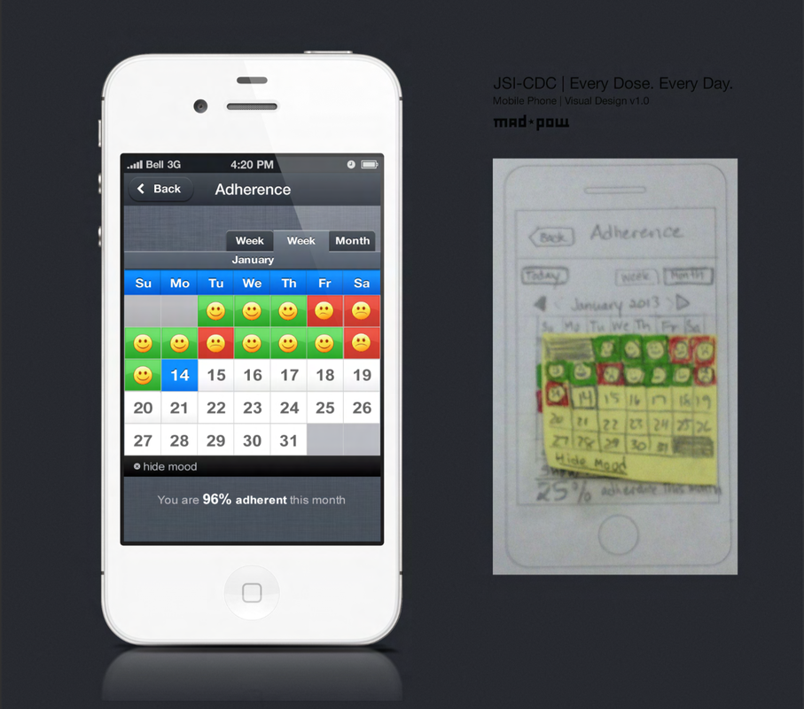
The Human-Centered Solution
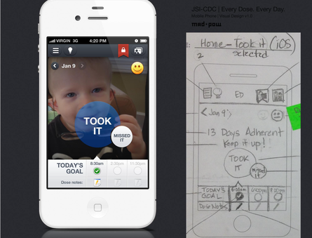
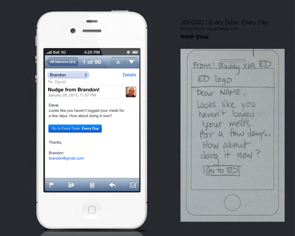
Enabling medication tracking was only one part of the experience we designed. To encourage patients to stick with their regimen, we created daily tips and links, a buddy tool for building a personal support network, and the ability to add an inspirational photo as a personal reminder of why medication adherence is important. We also created a Progress area that graphs CD4 count and Viral Load readings (lab data by which patient health is measured) so both patient and provider can have results handy for review, and patients can see the results of adherence over time. I then worked with our team's researcher to develop the prototype and test it with prospective users. We made revisions to the app based on test results before the final UI was created by our visual design team and implemented by our engineering partners. This Every Day, Every Dose (E2D2) app became a core part of the CDC's toolkit for educating on the importance of and encouraging HIV medication adherence.
Enabling medication tracking was only one part of the experience we designed. To encourage patients to stick with their regimen, we created daily tips and links, a buddy tool for building a personal support network, and the ability to add an inspirational photo as a personal reminder of why medication adherence is important. We also created a Progress area that graphs CD4 count and Viral Load readings (lab data by which patient health is measured) so both patient and provider can have results handy for review, and patients can see the results of adherence over time. I then worked with our team's researcher to develop the prototype and test it with prospective users. We made revisions to the app based on test results before the final UI was created by our visual design team and implemented by our engineering partners. This Every Day, Every Dose (E2D2) app became a core part of the CDC's toolkit for educating on the importance of and encouraging HIV medication adherence.
Sentara Healthcare MDOffice Physicians' Portal
The Business Ask
Based in Norfolk, VA, Sentara Healthcare is the largest integrated health care provider in southeastern Virginia and northeastern North Carolina serving more than 2 million residents. MDOffice, Sentara’s physicians’ portal, was created to serve the Sentara Medical Group as well as other clinicians who work within the network. Our team was asked to redesign the portal, addressing physicians as a unique audience with attention to automated transactions, reports, and information associated with daily work processes.
Other Challenges
Few physicians (or the staff that supported them) were visiting the existing portal because it was difficult to navigate, did not include all the necessary clinical tools and resources, and provided the same view of information to everyone. As a result, many of its intended users had developed their own workarounds for getting the information they needed. Updating the portal would not only involve organizing the information Sentara wanted to provide, but the gaps that these workarounds were filling.
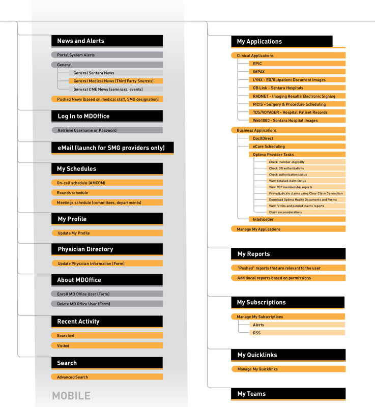
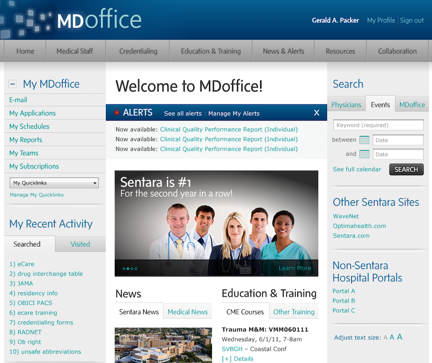
The Human-Centered Solution
After validating stakeholder requirements with the project team and interviewing both physicians and support staff across the organization, I created a role-based information architecture in which the user’s identity (e.g., cardiologist at Hospital A) drives which facility alerts, continuing medical education opportunities, and news will be visible upon sign-in. This profile-driven core is accompanied by a modular architecture that all facilities, business units, and groups can use to create a consistent experience across the site. After finalizing the information architecture in the form of wireframes, I oversaw the translation of the wireframes into a supporting visual design that was turned over with a supporting style guide to the Sentara development team.
After validating stakeholder requirements with the project team and interviewing both physicians and support staff across the organization, I created a role-based information architecture in which the user’s identity (e.g., cardiologist at Hospital A) drives which facility alerts, continuing medical education opportunities, and news will be visible upon sign-in. This profile-driven core is accompanied by a modular architecture that all facilities, business units, and groups can use to create a consistent experience across the site. After finalizing the information architecture in the form of wireframes, I oversaw the translation of the wireframes into a supporting visual design that was turned over with a supporting style guide to the Sentara development team.
The Getty Search Gateway
The Business Ask
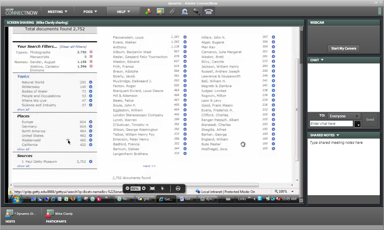
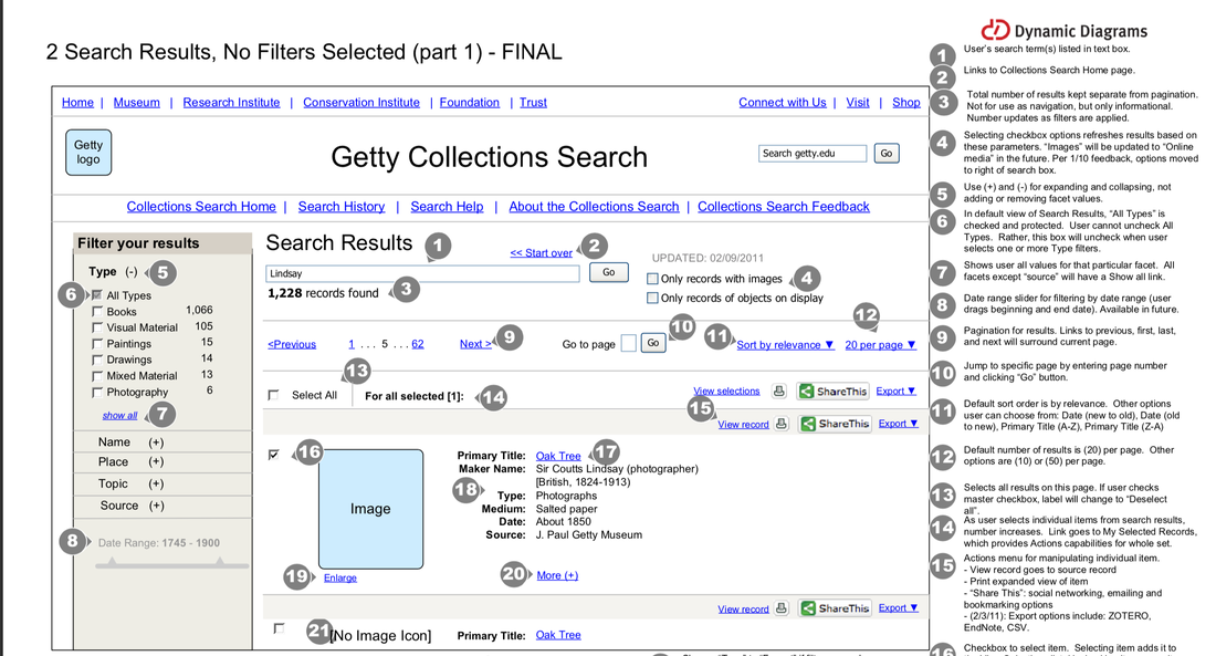
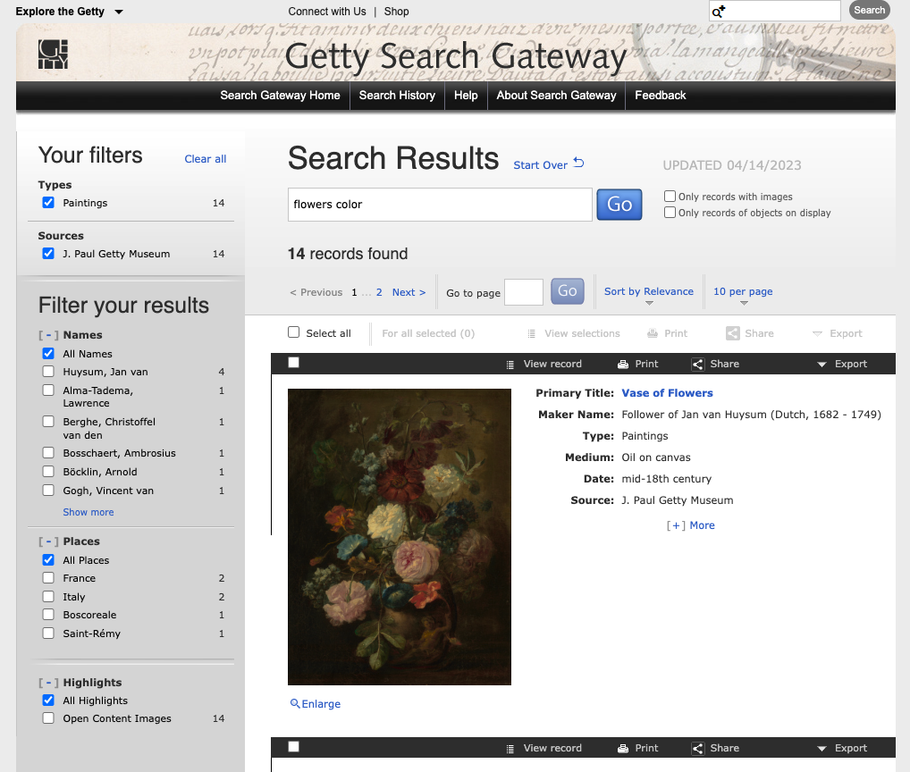
The information technology group at the J. Paul Getty Museum wanted to create a new single search tool that would enable users to search across multiple Getty databases including museum object records, library collections, and special collections holdings that represented the diverse collections at the Getty. The IT team had already built a working prototype that seamlessly connected collections across the Getty organization. But they did not know how to make it appealing to a wide variety of audiences. Our goal was to make sure that the gateway would both meet the needs of its various audiences, while providing an engaging, user-friendly experience.
The Business Ask
The information technology group at the J. Paul Getty Museum wanted to create a new single search tool that would enable users to search across multiple Getty databases including museum object records, library collections, and special collections holdings that represented the diverse collections at the Getty. The IT team had already built a working prototype that seamlessly connected collections across the Getty organization. But they did not know how to make it appealing to a wide variety of audiences. Our goal was to make sure that the gateway would both meet the needs of its various audiences, while providing an engaging, user-friendly experience.
The Human-Centered Solution
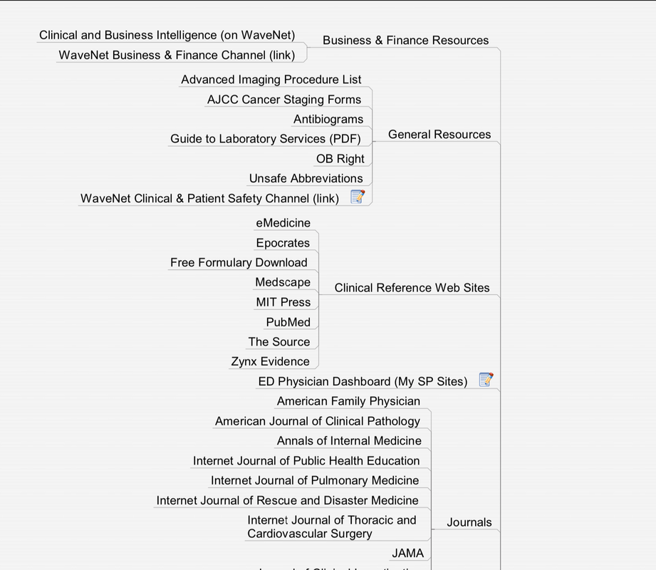
After getting a walkthrough of the existing prototype and reviewing similar tools, I developed a detailed list of requirements for the new user interface. Once the requirements were finalized with the technical team and senior stakeholders, I created a set of annotated wireframes which we showed to both stakeholders and target users ranging from staff to scholars to general art enthusiasts. Because the user interface was heavily interactive, I also wrote a supporting functional specification document that our team used to create a style guide and templates for the final search engine. Visit the Getty Search Gateway.
After getting a walkthrough of the existing prototype and reviewing similar tools, I developed a detailed list of requirements for the new user interface. Once the requirements were finalized with the technical team and senior stakeholders, I created a set of annotated wireframes which we showed to both stakeholders and target users ranging from staff to scholars to general art enthusiasts. Because the user interface was heavily interactive, I also wrote a supporting functional specification document that our team used to create a style guide and templates for the final search engine. Visit the Getty Search Gateway.
University of Southern Maine (USM) Portal
The Business Ask
The University of Southern Maine (USM) is the largest campus in the Maine university system, and had planned to migrate its web presence (a collection of 100+ microsites) to a new content management system. The university recognized this as an opportunity to create a new architecture that would provide a more intuitive user experience.
Other Challenges
USM wanted to make sure all of its cross-departmental information was consistent, so everyone (especially prospective students) could find what they needed. However, this information architecture also needed to be flexible enough so each department could highlight the individuality of each program both now and in the future.
The Human-Centered Solution
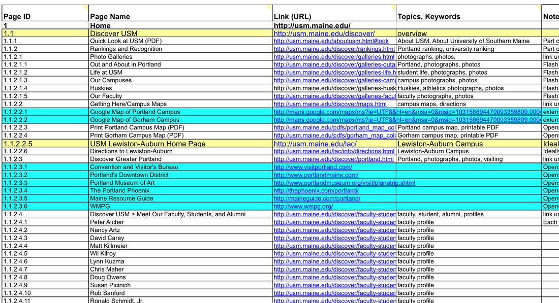
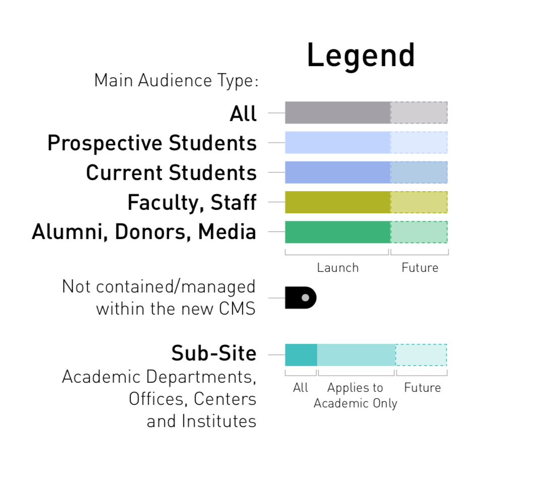
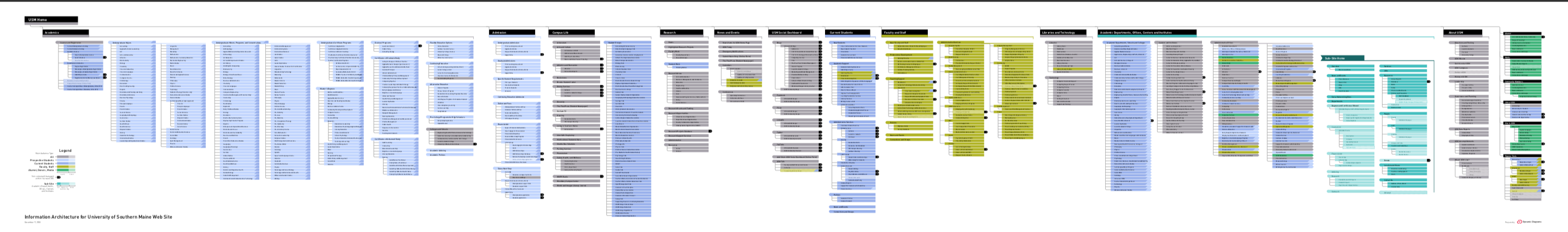
After working with the university's project team to interview stakeholders and users (faculty, administrators, and current/prospective students), we created a streamlined architecture that unites related information from disparate sources, such as course catalogs, academic departments and system-level databases. The large format IA diagram was not only a blueprint for the project, but a tool for building consensus across campus, and was regularly shown at open feedback sessions to get buy-in.
To encourage the feeling of an active community, the new architecture also highlights multimedia content, newsfeeds, and a dashboard of social networking activity to inform users of the latest happenings across multiple campuses. The new architecture is also modular, allowing content owners to use a standardized approach for growing the university’s web presence. Once the high-level user experience was finalized, I created the wireframes for key pages that were later used by the university's design agency to create the supporting visual design. The site has since been refreshed visually, but still uses the same information architecture that I developed. Visit the USM web site.